Tuesday, 5 May 2015

Experimenting with the papercuts

After completing WOSAT I started to experiment with alternative patterns and imagery that could be used to promote the fragrances used in my candles.

gold tissue paper was used for this one to tie it into the gold lids of the hexagon jars.


same pattern as above but with a white background

1 of the 2 layered lemons made from lots of tiny lemons cut out and overlapped

The second layered lemon, made same way as above, cutting out small lemons and gluing down on top of each other. Lemon shapes were slightly larger this time and came out neater too.

I wanted to find more textures so I ended up crumpling up the lemon cut out. I was quite pleased with the result.


Working with negative space.

Working with negative space. This one looks like a hypnotic eye to me.

I worked on some orange and lavender paper cuts but I feel that they need some more work and attention to them as they are much weaker than the lemon paper cuts.


The top image was originally a sunset scene with light clouds and a tree branch. I have used part of a dream catcher (left image above) to become the setting sun and then I have exaggerated the clouds using parts of the dream catcher background. The left image above has been combined with the top image with the setting sun used as part of the dream catcher and the tree branch has been added to follow the curvature of the feather. The right image above has been combined with the clouds from the two pictures below. I used the clouds because they are often fantasied in a dream like state and dream catchers capture the fragmented dreams.

These are only two pictures which I have placed down ladscape and portrait. I find that the top left image is better than its landscape alternative, which was the original idea. I find that it is better because the black parts of the image look almost as if it is a scruffy feather with the clouds in the background.
The bottom right image was the original idea for this image and I still prefer it from its portrait alternative. In  it I see the tops of houses with smoke coming out from them.
These collage pieces above were originally 5 drawings made on black paper canvas with soft pastels as the medium. They were created in response to some of my sunset images that I took for Digital Environment Project which included cloud lapses and sunsets in trees as well as dream catchers caught in the sunset. As the dream catchers are in this project too I will now continue further combine my experimental pieces with paper cutting, soft pastels and collage and further develop my fragrance images.

Monday, 27 April 2015

Final Decisions for WOSAT

I haven't been able to experiment much with my sticker designs but I will do so after WOSAT, for now I have to make a decision and start printing out the stickers.

Above are the three fragrances that I will be using in my candles; lavender, lemon and orange.


The images above show the small changes that I applied to the lemon and the orange stickers. When I did print these designs out I found that the text underneath the beeswax candle fragrance was too small to read. Not only did the text size need altering, but the square stickers had less of an impact when compared to the longer rectangular sticker. I decided to choose the rectangle sticker to develope further.


Above are the final sticker designs that I chose. The lemon sticker ended up being dulled down and having a darker boarder around the fruit to make it stand out more from the background. Yellow on yellow for the lemon sticker may not be the best idea as the colours tend to blend too much so maybe I should rethink the colour pallet. The lavender beeswax candle sticker is still my favourite as it works well as a small square sticker or a rectangle. The lemon and orange stickers don't have such an impact when they are on a rectangle or square sticker because they can only go so wide and would look too distorted if made longer.


Thursday, 23 April 2015

Sticker Labels

Time continues to get shorter and shorter.


In an idealistic world my stickers would be printed by someone else onto nice waterproof paper and I can just peel off the stickers and place them where ever I wish. However, as I have to consider the cost of stickers, as right now i have found a few sites online that will print stickers, everything is what I'd like but they want minimum orders of £30 or more pounds which means I could potentially have thousands of stickers when I only really need a maximum of 30 individual stickers. This now means I have to print and cut out the stickers myself... last time i tried to cut our a circle it wasn't smooth enough and the edges were rough... but hopefully a bit more patience will work. (fingers crossed) Below are screenshots of the different label ideas that I made on the computer.


Using Moo.com I designed some scent stickers with their online templates, however, as the images used are not my own so I cannot use them for my labels. I have however managed to sort out what colour backgrounds I want and which fonts work. I chose to stick with the fonts that I used on moo.com as there was a small selection, making it easier for me to stop being indecisive and forcing me to just choose ones which worked together. This worked well, I then had to find the fonts online and hope they didn't have any limitations if they could be used online or commercially (it was all fine anyway).

Research - Other Illustrators and Their Style

As I wasnt sure were to begin I decided research would be needed to help me come up with some sticker scent images. I knew I wouldn't be able to use photography as I don't have access to a lavender field and my lemon and oranges would look out of place if lavender wasn't photographed too.

Paul Oakley

Looking at his work he has created images that use a select few colours, often three, and then he applies darker shades to one of the colours to give his work more detail. His work reminds me a lot of paper cutting as the figures and shapes have been simplified, turned into silhouettes almost, which immediately appeal to me more as I have a slight fascination with silhouettes (and yet I still have to look up how to spell silhouettes) I think if I try and limit my colour palette then that will help me further to create images that stand out and work with the logo.

Jessie Ford

She has a handmade style to her work which I find adds a certain unique attractiveness to her work. The fact that it is all digital appeals to me even more as I want to have ago creating a purely digital drawing using the wacom tablet on the computer or my laptop.


I like this image the most by Jessie Ford as there is a lemon and an orange slice made up of delicate overlapping shapes that are duplicated over the top of on another. The use of textures works well and in an idealistic world I would try and recreate the faded areas that you might get when printing. I am not entirely sure how I will go about his but if I have the time then I will of course try. WOSAT is however very close now and I need to get my stickers designed in time.

Harriet Taylor Seed


I had a quick look at Harriet Taylor Seed's work but I do not like it very much as it is too busy, with too much going on at once. I prefer the image on the left as it has more simple shapes and everything is bigger where as the image on the right is very busy. I cant make sense of what is going on in the image as it is too jumbled together with too many colours merging together. I did notice that in her work she has managed to create the faded affect that would normally be seen with prints, which is also appealing to see as Jessie Ford also recreated this effect too.


The top left section and the bottom right sections are visually the most attractive to me as the lower right image is made using purple colors which I enjoy the most. The top left gets my attention because I am looking for lemons to give me ideas for the image to go on my labels. The use of different textures in his work adds even more detail which helps to limit the colour palette as well which allows the viewer to become overwhelmed with the colours used.

Drawing my Images


I chose to use the wacom tablet to digitally draw my images as I have never used the tablet before but I decided not to let that stop me. I tried to use it on the double monitor screens that we have on the desktop computer but I ended up using my own laptop because I was struggling to get used to the different scales in size, I also wasn't sure how to make to the tablet stick to only photoshop but I managed eventually to sort it all out.

I began with a lemon. I decided that I didn't want to use a lemon slice as the shape of the lemon can be symmetrical and is smooth and curving. With the orange I will create this as a slice because oranges are generally just round and this isn't visually very appealing to me. It also means it stands out from the lemon image too. The lavender image I haven't yet decided how I will make it look, but I think I will have a bunch of lavender tied together.


Above are the digital drawings that I made using the wacom tablet and photoshop. I originally saved them as a PNG file as it made it easier to alter the background colours and if I wanted to apply the images to moo.com templates then the moo background colours would fill in the empty spaces. These designs were intended for square stickers that moo.com create but when I decided that I would be the one to print my own stickers I chose to make both square and taller rectangle stickers instead as I could easily compare them and see which would look better.


Monday, 20 April 2015

designing the labels

now i know which scents i am using for the candles and the lip balms i can start designing them.


what's the fragrance
what will be the colours
where will the label go
what is the content


Lemon Beeswax Candle
 Mrs Meyers Lemon Soy Candle
Mrs Meyers Lemon Soy Candle


Label on the bottom and around the top of the jar. The bottom label is effective as it has the barcode and the caution warnings too. Doesn't say if it has a fragrance though but colour gives away indications that it has a lemon fragrance.

Woodwick Lemon Candle

The wood wick candle is much more decorative which stands out more. The colours give away the fragrance as well as the clear labeling for the smell. Inside the lid is decorative too and has the caution label.


Lemon Honey Candle
The candle above in the mason jar has effective labels. The lid is decorative but plain, I can see my own logo going on the lid. The fragrance label is big enough to read but doesn't cover up the rest of the jar, which is what I don't want to do either. I want to be able to see the wax melting and how much is left without having to peer around a label or into the jar.

Lemon Scented Candle

 This candle brand has a different colour and illustration on the side of the box for each scent. I find this style the most appealing as all the info is on one side and then the decorative part is on another,

Tuesday, 31 March 2015

Beeswax refining


The top two images are of some beeswax that I had already filtered through a muslin cloth but had failed to filter out enough of the bits I didn't want in the wax. It was broken up into chunks to help in all melt quicker.

The image to the left is a clearer photograph taken on my phone showing what the beeswax looks like before it has melted and been filtered.

Once all the raw beeswax has melted you get a waterproof container, such as a paper juice carton, and you create a filter from a fine mesh material such as a muslin cloth that you pour the melted wax through into the juice carton. The paper carton is useful because unless you have a mold that you can easily remove the wax from the carton can be cut and then ripped to get out all of the wax. When I first tried refining some of the raw beeswax I didn't realise that below the hardened wax that is on the surface is liquid. I learnt quickly though and every time I cut open a carton I would avoid mess by opening it in the sink.

This photograph to the left is what the beeswax looked like in the juice carton before I cut it out of the box.
The last image you can just about see the liquid that is below the hardened wax flowing over the wax.


Tuesday, 24 March 2015

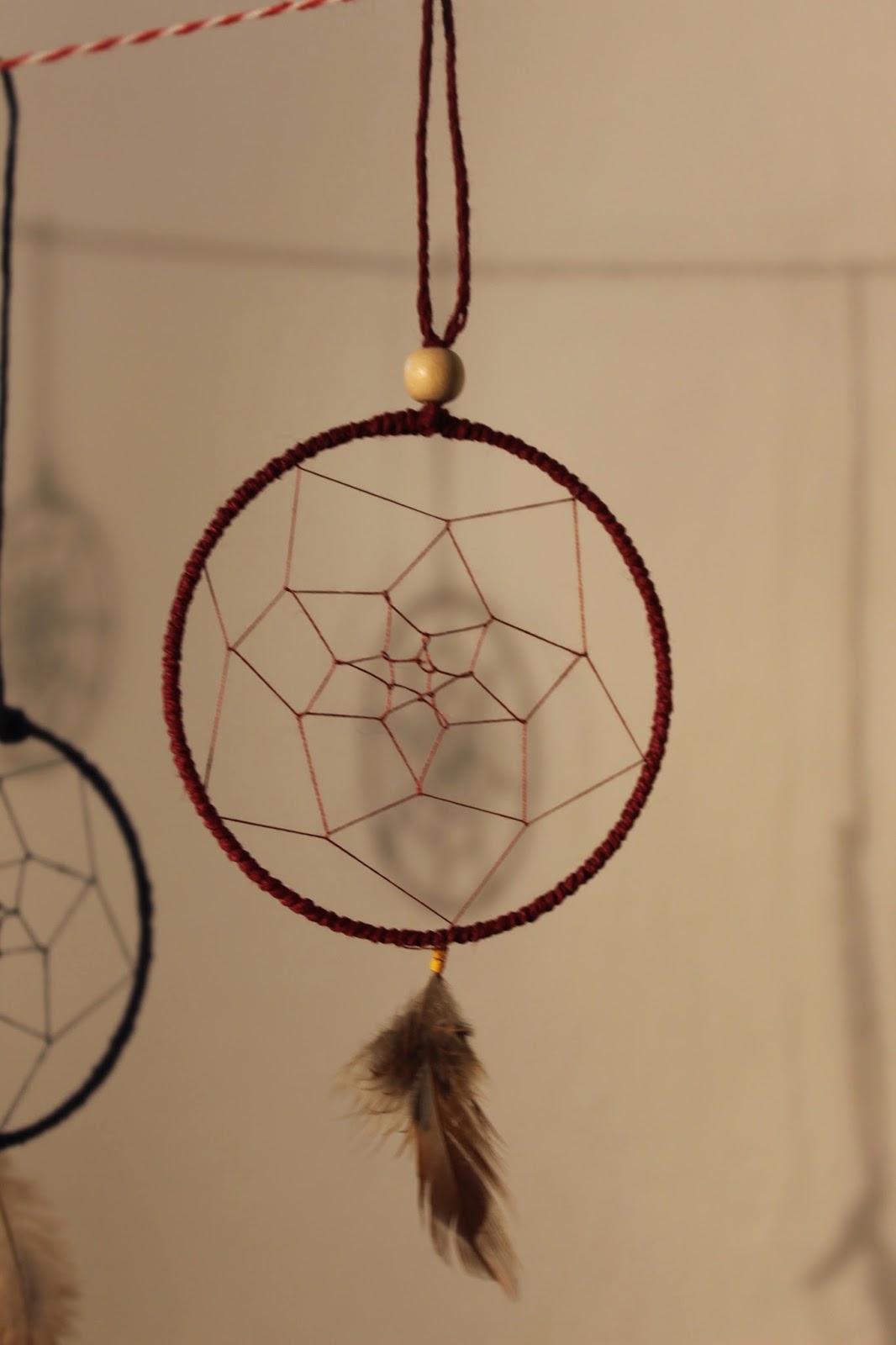
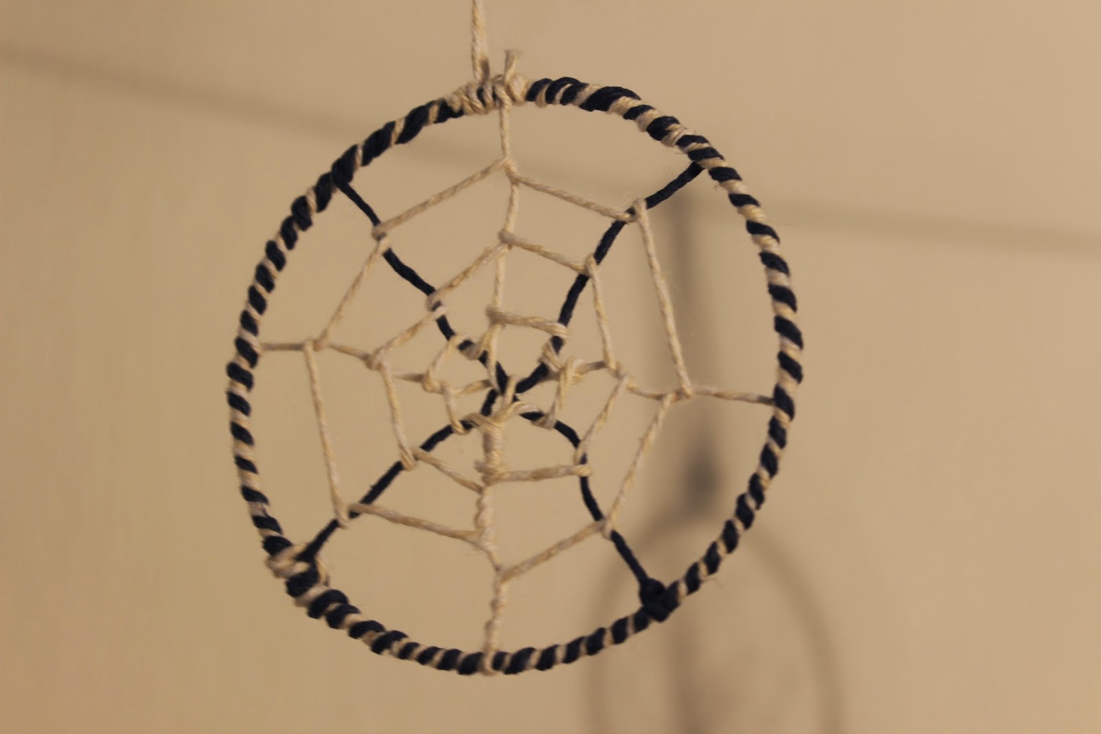
My dreamcatchers


My own photographs taken with my lumix g3 camera using manual focus. These are edited using photoshop.