


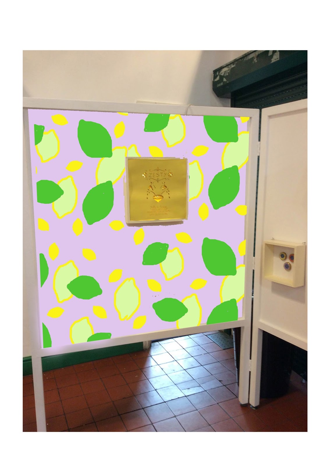
I have created two prototype mock up example of what my point of sale posters will look like. I have decided that boxes made from wood will be used to house my work in. A back panel behind all the card/paper will be used to attach fairy lights or led strips on to it. Hopefully the led strips, if used, will have enough adhesive on them to begin with that I wont need to do much to them to make them stick.
My point of sale posters are also going to be all of one colour. If I manage to design the cut outs chunky enough, i wont need to add in other colours as the light with change the shades of the card anyway.
note: whilst putting up my exhibition space I now realise that it was a good thing I did not make three point of sale back lit pieces because my space has three walls so to speak and my hexagon shelf sits neatly in the middle of the two back lit boxes.


No comments:
Post a Comment