Despite wanting to use low tech and time consuming methods such as paper cutting to create my final outcomes I have managed to create my exhibition pieces within schedule, meeting the deadline. I do feel however that I focused too much on the products and not enough on the packaging of the products. I think this is partly why I moved towards creating a point of sale poster/sign because I was more focused on the branding rather than both branding and packaging. I think that if I had decided on what my exhibition was going to be and started to work on it maybe a month or more before I did originally, then I would have managed to have experimented some more with paper cuts. I also think that I would have been able to manage my time a bit better too as I feel that most of my attention was focused more on this project and less on other that may have needed more work done to them.
I chose to hand cut my point of sale posters because it is more personal and I can just sit down and focus purely on the cutting of the paper/card. I don't have to wait for computers or software to work, I have less errors this way too, or less errors that I can blame other things or people for. If I make a cut where I shouldn't have or nick the paper in just the wrong place then it is only me who gets told off.. by me.. I have more control this way, I suppose that is more clear, more control.
I chose to use my square card for my final product because for one part it was what I readily available at home, I didn't have to go out and buy new card as it had been sat unused for at least a year and a half. The other part of it is that I did not want to use a normal paper size, I didn't want to create something that was small like A5, or even A4 with a trim on the portrait height of it. My original plan was to have originally used A4 paper, trim it, then cut it, but I am glad that I used a better quality card-stock as well as a better quality and sharper craft blade.
In the future I will continue to use paper cutting as my most chosen technique to create work. If I could do more to this project then I would look at redoing the labels on the candles, as well as creating hanging tags that could go around the necks of the candle jars as my exhibition showed me that my larger but short candles don't show the logo or what the scent is very well unless you look at them from above or below if the shelf happens to be glass but again these are unrealistic because you would either have to be a child or just very short to look under a shelf, or incredibly tall to be able to read the tops of the candles. Having hanging name tags would solve this issue rather easily. More focus on the packaging, such as a box to put the candles in. Would the box have a pattern cut into it or would it just have a coloured print on the box. Maybe that will be answered in the future.
Wednesday, 24 June 2015
Digital Edits


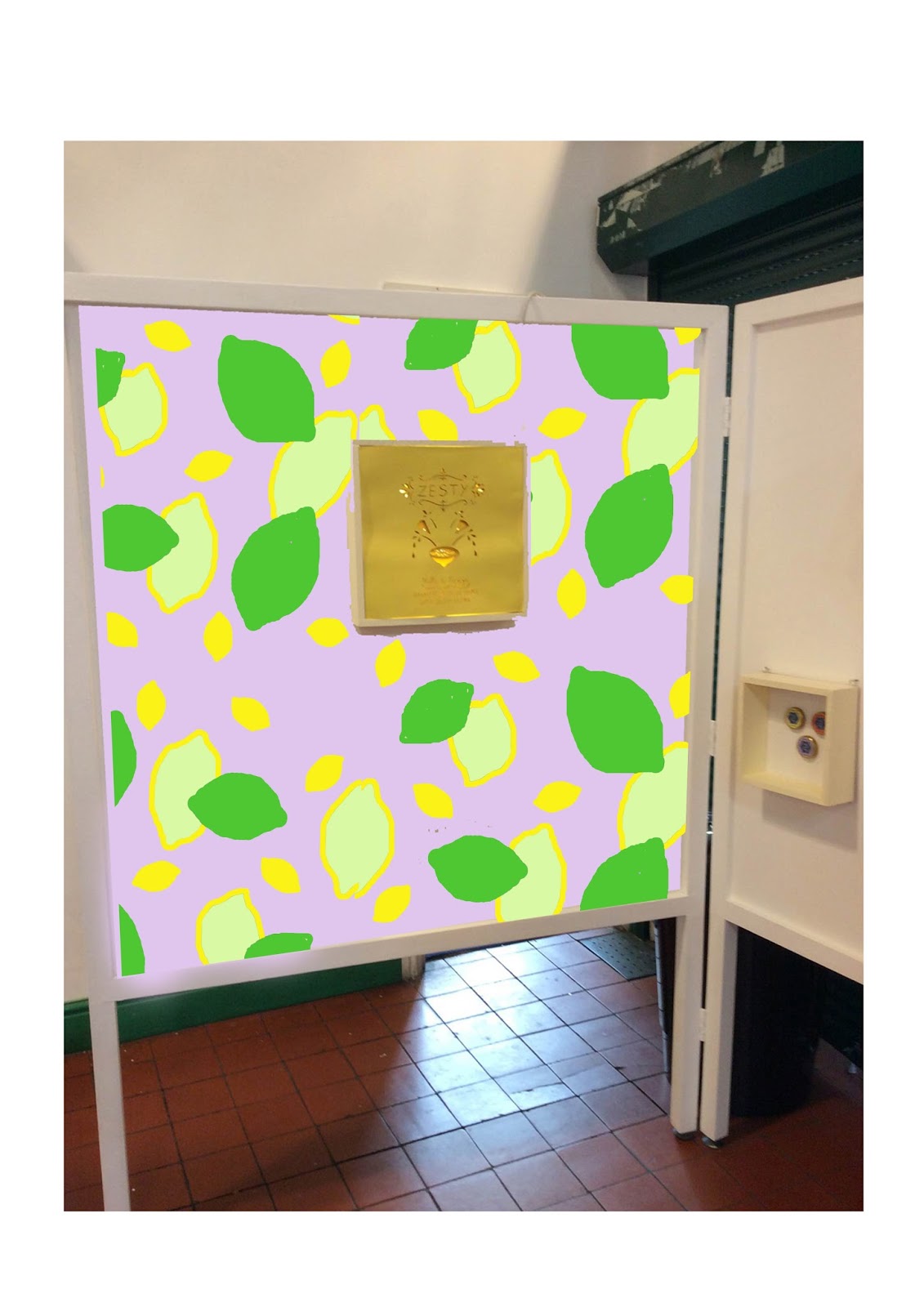
I have created two prototype mock up example of what my point of sale posters will look like. I have decided that boxes made from wood will be used to house my work in. A back panel behind all the card/paper will be used to attach fairy lights or led strips on to it. Hopefully the led strips, if used, will have enough adhesive on them to begin with that I wont need to do much to them to make them stick.
My point of sale posters are also going to be all of one colour. If I manage to design the cut outs chunky enough, i wont need to add in other colours as the light with change the shades of the card anyway.
note: whilst putting up my exhibition space I now realise that it was a good thing I did not make three point of sale back lit pieces because my space has three walls so to speak and my hexagon shelf sits neatly in the middle of the two back lit boxes.


Point of Sale
these three patterns were made using scans of my paper cut texture tests. They were all saved as jpegs but I then altered them using photoshop. The purpose of these are to see if small repeated patterns such as the first and second image look appealing. I can then see them being printed onto tissue paper and used to package the candles.

As well as the tissue paper packaging patterns, I combined my labels from the candles for wosat and placed them together as if they were tiles. Seeing the labels on a spread together makes them work better than they do on their own as the constant pattern with the changed background make the work bolder and stronger. I was more conscious this time to use more feminine colours, which can be seen in the lower line of pink, green, blue and yellow and lilac labels.


As well as the tissue paper packaging patterns, I combined my labels from the candles for wosat and placed them together as if they were tiles. Seeing the labels on a spread together makes them work better than they do on their own as the constant pattern with the changed background make the work bolder and stronger. I was more conscious this time to use more feminine colours, which can be seen in the lower line of pink, green, blue and yellow and lilac labels.
 |
| I was trying out the layout of the lemon paper cut pattern and using the same effect as above to try out the different colours. I didn't use text because it wasn't part of my main focus and I felt that it would distract me from trying out different colours. |
 |
| I tried a different layout with a different part of the lemon paper cut scan pattern. I applied text this time but I was not focusing on the text this time round either. |
 |
| third layout but this time with the orange paper cut. |
 |
| The last point of sale layout for posters that I made. I used the scans and Photoshop to duplicate the orange paper cut pattern. i think these are too busy and distracting and the text does not work well at all either. it might look better if the plain coloured text was wider and the text could be arranged all along one side leaving more of a coloured blank space as a boarder. |
 |
| mock up of a window display with two of my point of sale poster layouts included. I perfer the lemon point of sale poster as I find the colours to be more relaxing. |
Wednesday, 3 June 2015
Research on Orange, Lemon and Lavender
I don't know much about the three fragrances that I chose to use other than what they smell, look and taste like. I've never seen an orange or lemon tree in real life and I find that other than a circular shape and the colour orange is not much different from a lemon, visually I mean. I need to find out what their blossoms look like as they both grow on trees too.
As far as I know, Oranges originated in Southeast Asia, but today Brazil grows 1/3 of all the world's oranges and California and Florida are also large producers of oranges in the US. Oranges generally have 10 or more segments which can have seeds or pips inside them.
Orange
 |
| orange blossom |
 |
| Parts of a flower |
Orange blossoms are fragrant, bloom in clusters of 1-6 and are perfect with 5 petals and sepals. The petals are linear, sometimes can curve lengthwise and are thick. Sepals fuse at the base to form a small cup. Stamens on the blossom number from 20 - 25 and are arranged in a tight, columnar whorl around the gynoecium.
Lemon
Lemons are native to Asia, Northeast India, North Burma and China. The top 5 producers of lemons in the world includes; China, India, Mexico, Argentina and Brazil.
 |
| Lemon Blossom |
 |
| Lemon Blossom showing tinted base |
Lemon Blossoms are a white flower that have 5 fragrant petals with a yellow tinted base.
Lavender
 |
| English Lavender |
 |
| French Lavender |
 |
| Spanish Lavender |
Lavender originated in the Coastal Hills of the Mediterranean. Over 115 varieties of lavender are cultivated around the world. Lavender is primarily derived from basic English, French or Spanish Lavender.
So my attempt of research to help me come up with other ideas to separate orange and lemon from each other has failed. The flowers are pretty much the same for both fruits. Back to the drawing board I think.
Tuesday, 5 May 2015
Experimenting with the papercuts
After completing WOSAT I started to experiment with alternative patterns and imagery that could be used to promote the fragrances used in my candles.
I worked on some orange and lavender paper cuts but I feel that they need some more work and attention to them as they are much weaker than the lemon paper cuts.
 |
| gold tissue paper was used for this one to tie it into the gold lids of the hexagon jars. |
 |
| same pattern as above but with a white background |
 |
| 1 of the 2 layered lemons made from lots of tiny lemons cut out and overlapped |
 |
| The second layered lemon, made same way as above, cutting out small lemons and gluing down on top of each other. Lemon shapes were slightly larger this time and came out neater too. |
 |
| I wanted to find more textures so I ended up crumpling up the lemon cut out. I was quite pleased with the result. |
 |
| Working with negative space. |
 |
| Working with negative space. This one looks like a hypnotic eye to me. |
I worked on some orange and lavender paper cuts but I feel that they need some more work and attention to them as they are much weaker than the lemon paper cuts.
 |
| The top image was originally a sunset scene with light clouds and a tree branch. I have used part of a dream catcher (left image above) to become the setting sun and then I have exaggerated the clouds using parts of the dream catcher background. The left image above has been combined with the top image with the setting sun used as part of the dream catcher and the tree branch has been added to follow the curvature of the feather. The right image above has been combined with the clouds from the two pictures below. I used the clouds because they are often fantasied in a dream like state and dream catchers capture the fragmented dreams. |
 |
| These are only two pictures which I have placed down ladscape and portrait. I find that the top left image is better than its landscape alternative, which was the original idea. I find that it is better because the black parts of the image look almost as if it is a scruffy feather with the clouds in the background. The bottom right image was the original idea for this image and I still prefer it from its portrait alternative. In it I see the tops of houses with smoke coming out from them. |
These collage pieces above were originally 5 drawings made on black paper canvas with soft pastels as the medium. They were created in response to some of my sunset images that I took for Digital Environment Project which included cloud lapses and sunsets in trees as well as dream catchers caught in the sunset. As the dream catchers are in this project too I will now continue further combine my experimental pieces with paper cutting, soft pastels and collage and further develop my fragrance images.
Monday, 27 April 2015
Final Decisions for WOSAT
I haven't been able to experiment much with my sticker designs but I will do so after WOSAT, for now I have to make a decision and start printing out the stickers.


Above are the final sticker designs that I chose. The lemon sticker ended up being dulled down and having a darker boarder around the fruit to make it stand out more from the background. Yellow on yellow for the lemon sticker may not be the best idea as the colours tend to blend too much so maybe I should rethink the colour pallet. The lavender beeswax candle sticker is still my favourite as it works well as a small square sticker or a rectangle. The lemon and orange stickers don't have such an impact when they are on a rectangle or square sticker because they can only go so wide and would look too distorted if made longer.


Above are the three fragrances that I will be using in my candles; lavender, lemon and orange.

The images above show the small changes that I applied to the lemon and the orange stickers. When I did print these designs out I found that the text underneath the beeswax candle fragrance was too small to read. Not only did the text size need altering, but the square stickers had less of an impact when compared to the longer rectangular sticker. I decided to choose the rectangle sticker to develope further.


Above are the final sticker designs that I chose. The lemon sticker ended up being dulled down and having a darker boarder around the fruit to make it stand out more from the background. Yellow on yellow for the lemon sticker may not be the best idea as the colours tend to blend too much so maybe I should rethink the colour pallet. The lavender beeswax candle sticker is still my favourite as it works well as a small square sticker or a rectangle. The lemon and orange stickers don't have such an impact when they are on a rectangle or square sticker because they can only go so wide and would look too distorted if made longer.
Subscribe to:
Posts (Atom)